my approach to learning experience design is to engage through color, video, and real human stories.
education: ux design certification, masters of education,
experience: sr. learning experience designer at peloton, instructional designer at teach for america
tools: figma, adobe photoshop/illustrator/premier, lessonly, procreate, articulate, rise 360
DISCLAIMER: Please note that while this portfolio showcases a selection of my work as a learning designer, not all projects or materials created during my employment with previous organizations are included. Certain projects may not be featured due to confidentiality agreements or intellectual property rights held by the respective employers.
For a comprehensive understanding of my capabilities and experiences, please feel free to reach out to me directly :)
DACI
the company: PELOTON
the opportunity: to streamline decision making frameworks across the organization
the ~4k learners: people leaders and their direct reports
the deliverables:
-videos
-elearning
-live workshop
the data and impact:
95% satisfaction rating
92% learning objective met
289 resource downloads
data goal for next time:
- measure long term impact
through post project surveys
- measure implementation of framework
the process
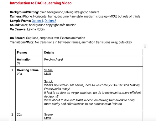
1. scripting - it was important to write out a script for this video to get it peer reviewed by designers, leaders, and SMEs before filming
2. storyboarding - this was important to stakeholders to be able to visualize
yes i drew
these doodles!
3. recording/editing - i recorded on an iphone to make things easier on high quality but then edited on adobe premier (i created the animation assets you see in the video)
the result
4. final deliverables


MEMBER SUPPORT
the company: PELOTON
the opportunity: to refresh member support curriculum and pathways
the ~200 learners: member support leaders and associates
the deliverables:
-curriculum
-learning pathways
-30-60 elearnings
the data and impact:
100% member support participation
95% satisfaction rating
90% learning objective met
goal for next time:
buy in from current member support associates
example lesson


example of a lesson revamp
on articulate + part of the
lesson survey used to
measure short term impact
(reaction + learning data on
kirkpatrick assessment levels)
NEW TEAM
MEMBER
LIVE EXPERIENCE
the company: PELOTON
the opportunity: to offer a 3 day LIVE experience for new peloton employees to immerse them in culture, people, and teach them about the business
the ~100 learners: newly onboarded members of peloton
the deliverables:
-10 business presentations (executives)
- 3 workshops
- branding
- activities
the data and impact:
goal for next time:
the process
my primary role: consulting executives/assistants across cross functions to create engaging ten 25 min presentations for new members and building workshops for day
Note: this required organizing and project managing weekly calls with stakeholders to ensure interactive and impactful deliverables. unfortunately, i cannot share assets from this project but am happy to talk about it.
my secondary role: creating branding and merch for the event, organizing team building activities, creating LIVE photo presentations


FACILTATION EXPERIENCE
the impact:
~1000+ learners
peloton
woman's alliance: professional development
let's get reel: the series
member support
social/retreat hours
learners: people at peloton
space between
mindfulness in elementary classrooms
learners: teaching professionals
teach for america
measuring data in elementary mathematics
bringing back history to mathematics and data
learners: teaching professionals
spring academy
measuring mastery data in mathematics
learners: teaching professionals
EVENT
APPLICATION
the opportunity: how might we help improve people’s lives to make conscious use of technology to extend their abilities while avoid its pitfalls?
what: an event application that benefits users by allowing them to experience more in person and benefits businesses/nonprofits to build awareness around their events
my role: ux designer
time: 8 months
the process
1) anecdotal research summary:
-
participants felt least distracted by technology when doing activities they loved with the people they loved.
-
participants felt like the social benefits of technology involved a) using it as a resource (e.g. FB events) b) staying connected with friends & family
-
participants felt notifications were a major distraction and the iPhone feature of time limits on applications did not feel incredibly useful
2) competitive analysis summary:
there are many applications that aim to help users limit their notifications or time on
social media. and less applications that offer better uses of that same time. what if there was an application that allowed users to feel the social benefits of technology instead of restricting use altogether?
3) archetypes & journey mapping
the social butterfly the multi-tasker
4) flow decisions
all potential concepts and features were tested by participants and I decided to move forward with the following features and started creating user flows, site maps, card sorts, low and mid level fidelity wireframes and prototype.
5) visual decisions
here is how/why the logo and name came to be along with the final prototype and style guide:
6) next steps
features to enhance, change, or remove based on participant feedback:
- web or desktop version for users who do not want to sign up
- integrate with calendar better


