top of page
logo work
making other human's visions come to life
thiselle creek farm

YACOLT, WA- Kenzie asked for a logo that would represent her family & values for her farm. She requested simple black and white line work and expressed she envisioned "dreamy, rustic, calm, & community". Her vision involved bees, flowers, silos, trees, animals, and fruit. So we did a little bit of all of it. If you live in the PNW, this farm is very worth the visit. The tote bags are my favorite! thisellecreekfarm.com
Currently working on some farm activity sheets for kids that visit the farm!


teach for america


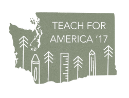
SEATTLE, WA- Teach for America asked me to come up with a brand for their annual event that would represent the PNW, was trendy, and simple enough to include in lots of merchandise. This logo reached 1000s of people and ended up on shirts, posters, mugs, stickers, and is still used for sweatshirts for new corps members.

i enjoy connecting the dots with other beings. let's chat.
email linkedin shop resume
meadow larch woodworks
PORTLAND, OR- Loren mentioned his love for larch trees in the PNW and earthy autumn colors. I used my signature line work to create a logo that emphasized the PNW, a larch tree, while keeping it simple enough for him to engrave into his wood work.


This logo was just finalized in March 2022,
come back to see samples of wood with the logo on it :)
oaks and acorns doula
OJAI, CA - This client wanted to start a doula business and wanted simple line art and represent both the oak and acorn in some way. I gave the logo feminine energy by using a circle and curved flowing lines connected to the circle (feminine) to subtly resemble an umbilical cord. They loved how it turned out!


reef side
SANTA CRUZ, CA - I WON A LOGO CONTEST!
I entered a logo contest for a recreational marijuana company that is located in a surf city so I thought about what those two things had in common and thought of this overlapping shape. Since, they have recolored and took out the wave. reefside.co

older work


Wedding party favors in the form of
stickers for a camping wedding in
the PNW. The moon/sun is a tattoo
the couple shares.
Book cover for a client for their first
published book! You can find it here.
Stickers for a client to sell at his shows
in Seattle. David is extremely talented.
You can find his music here.
bottom of page

